Introduction
Most landing pages look good… but don’t convert. And honestly? A beautiful design without strategy is just decoration. A landing page should work for you — like a silent salesperson that knows exactly what to say, what to show and how to guide visitors to take action. In this guide, we’ll break down the essential elements you need to build a high-converting landing page using simple, practical steps you can apply today. You’ll learn how to write a headline that instantly grabs attention, where to place your CTA, how to use visuals to build trust and which small design choices make the biggest difference in conversions.
Clear, helpful, beginner-friendly — let’s build a landing page that actually sells.
Essential Elements of a High-Converting Landing Page
Craft a Headline That Speaks Directly to the User
Your headline is the first “yes” your visitor gives you. If it’s weak, you’ve lost them before they scroll.
A high-performing headline is:
-
short
-
clear
-
benefit-driven
-
aligned with the user’s intention
Bad: “Welcome to Our Store”
Better: “Get Shoes Made for All-Day Comfort — 50% Off Today”
Use numbers, outcomes or urgency when natural.
Your goal: make the visitor think “Oh, that’s exactly what I need.”
Use High-Quality Visuals That Tell a Story
Visuals aren’t decoration — they’re persuasion tools.
Strong visuals include:
-
product photos
-
short demo videos
-
before/after comparisons
-
“how it works” clips
Why it works:
-
users process images 60,000x faster than text
-
videos increase time on page (Google loves that)
-
clarity = trust
Tip: Always compress your images and test on mobile. A slow page kills conversions faster than any bad headline.

Highlight Offers, Discounts and Urgency Cues
People love deals — but more importantly, they love feeling smart about making a good decision.
Use elements like:
-
countdown timers
-
“limited stock” indicators
-
free shipping banners
-
seasonal promotions
Pair it with a strong CTA:
-
“Claim Your Discount”
-
“Unlock 40% Off Now”
Just avoid fake urgency — Google hates it and users smell it.
Build Trust With Real Customer Reviews
A landing page without social proof is like a shop with empty shelves — people hesitate.
Add:
-
real names
-
short quotes
-
photos or video testimonials
-
rating stars
-
links to trusted review platforms
Why it matters:
Reviews can increase conversion rates by up to 34%, especially when they remove fear or uncertainty.
Display Trust Badges and Secure Payment Options
Security is a conversion factor, not a design detail.
Show:
-
SSL badge
-
Stripe / PayPal
-
Money-back guarantee
-
“Secure Checkout” badge
When people feel safe, they buy faster.

Step-by-Step Design & Copy Checklist
Create a Clean, Focused Layout
A cluttered landing page = decision fatigue.
Your layout should guide the eye:
-
Hero section: headline + subheadline + main CTA
-
Value explanation: what problem you solve
-
Visual support: photo/video
-
Social proof: reviews
-
Offer details
-
Second CTA
Keep whitespace. Whitespace is not empty — it’s intentional breathing room that directs attention.
Use Clear Categories and Filters (for product-based pages)
If your landing page includes multiple products, help users find what they came for.
Useful filters:
-
price
-
size
-
color
-
category
Why it works:
The faster they find what they want, the faster they buy.
Write Copy That Feels Human and Helpful
Your copy should sound like a conversation, not a brochure.
Avoid:
-
corporate language
-
long, heavy sentences
-
vague promises
Use:
-
simple words
-
direct benefits
-
realistic outcomes
Think: “Here’s what you get, here’s why it matters, here’s what to do next.”
Use Simple, Short Forms
Short forms convert. Long forms scare people away.
Only ask for what you need:
-
name
-
email
Optional fields kill conversions.
Your CTA button should finish the sentence:
-
“I want to…”
-
Get My Guide
-
Start My Trial
-
Book My Spot
-

Testing, Tracking & Continuous Optimization
Monitor the Right Metrics
Don’t guess — measure. Focus on:
-
conversion rate
-
bounce rate
-
scroll depth
-
CTA click-through rate
-
form submission rate
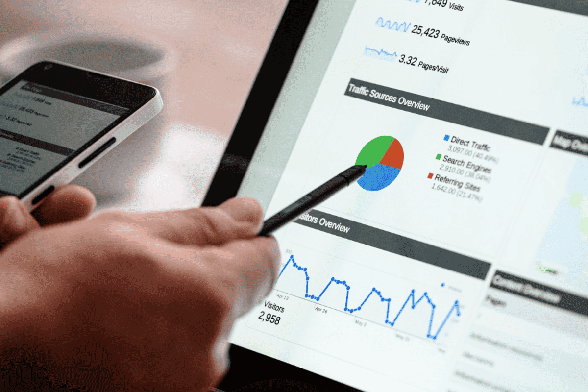
Tools like Google Analytics and Hotjar help you see real behavior.
Run Smart A/B Tests
Small changes. Big impact. Test:
-
headline variations
-
CTA button text
-
button color or placement
-
hero image
-
offer structure
Only test one thing at a time or your data becomes useless.
Use Tools That Make Optimization Easier
Recommended tools:
-
Google Optimize alternatives: VWO, Convert
-
Heatmaps: Hotjar, CrazyEgg
-
Page builders: Elementor, Webflow
-
Speed testing: GTmetrix, PageSpeed Insights
And yes — fast pages convert better.
Conclusion
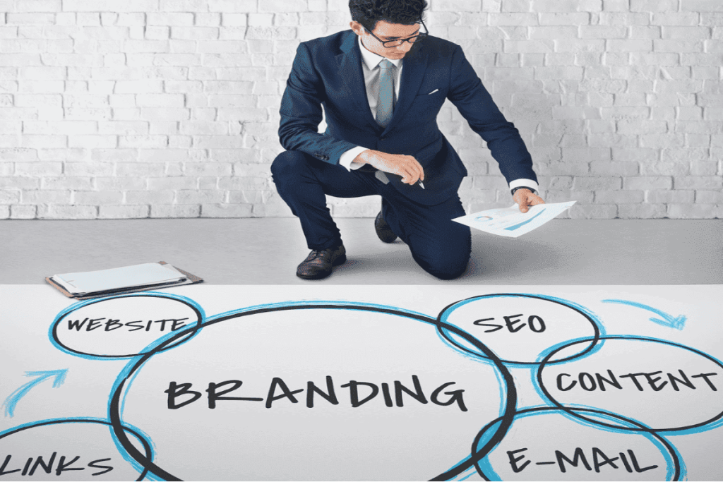
A high-converting landing page isn’t complicated — it’s strategic. With a clear headline, strong visuals, trust signals, simple forms and smart testing, you can turn more visitors into paying customers without redesigning your entire site. Start by improving one section at a time, track your results and adjust based on real behavior. Want to go deeper into branding and messaging? Check out our guide on What Is a Brand (and Why Small Businesses Need One) for the next step in building a strong online presence.
FAQ:👉 How to Build a High-Converting Landing Page That Sells
1. How many CTAs should a landing page have?
1–2 is enough. Too many CTAs confuse users. Keep one main action and place it strategically.
2. Why is page speed important for conversions?
Slow pages lose visitors. Even a 1-second delay can reduce conversions by 7%. Optimize images and hosting.
3. Do I need a video on my landing page?
No — but videos help build trust and explain value quickly. If you have a clear, short video, use it.
📱 See It in Action
Watch our short Instagram reel to see how these strategies come to life 👇
big goals, small steps 💫